UX OF PINK
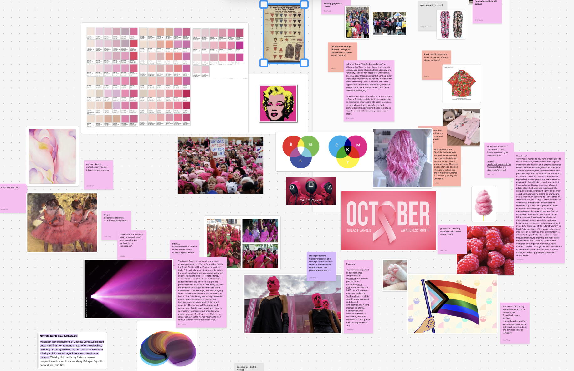
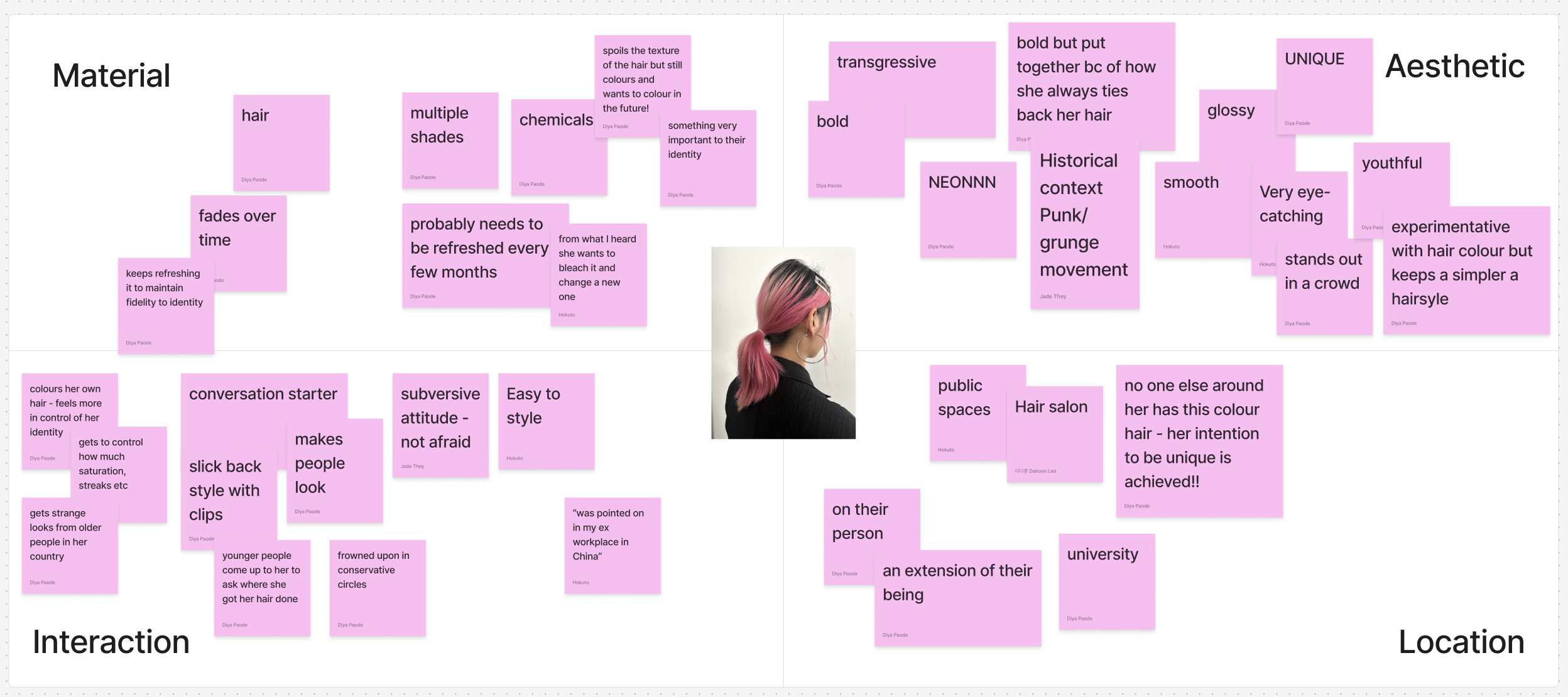
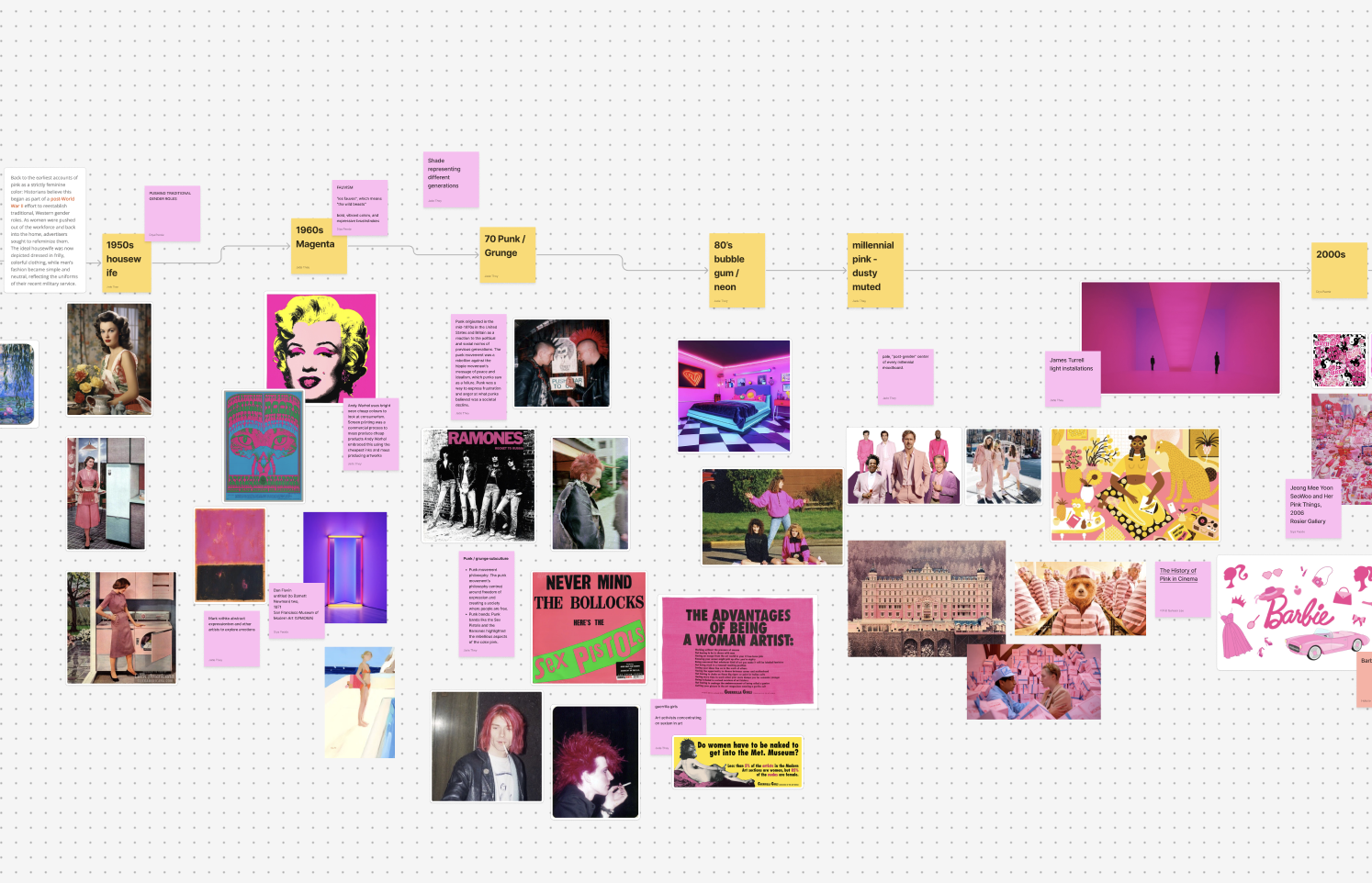
We used the artefact analysis to try to help determine a direction and decided on Grania’s hair. The most interesting observation was the subversive element of dying hair in this vibrant colour and its involvement with the cultural history of the colour. We noticed its shade was strongly associated with the punk/grunge movement and, more recently, pop punk. I then mapped the historical associations of particular shades in cultural movements of the centuries. I found that most generations dating back to the Renaissance had their own particular shade of pink relating to some sort of cultural significance in Western culture. We decided to go ahead with this idea and find this generation’s pink, imbuing it with all the qualities that this generation needs. The 1900s had sophistication, the 1950s had femineity, and the 1970s had rebellion. What would the 2010s want from their shade?
Chen Chen
Diya Paode
Dahoon Lee
Wanrui Ren
Brief: make an experience of the characteristics of pink.
Brainstorming this topic was very hard. We went in a number of different directions, including the use of the colour as a sign of youth, pink flavours in food, uses indicating femininity, and subsequent uses in the feminist movement.
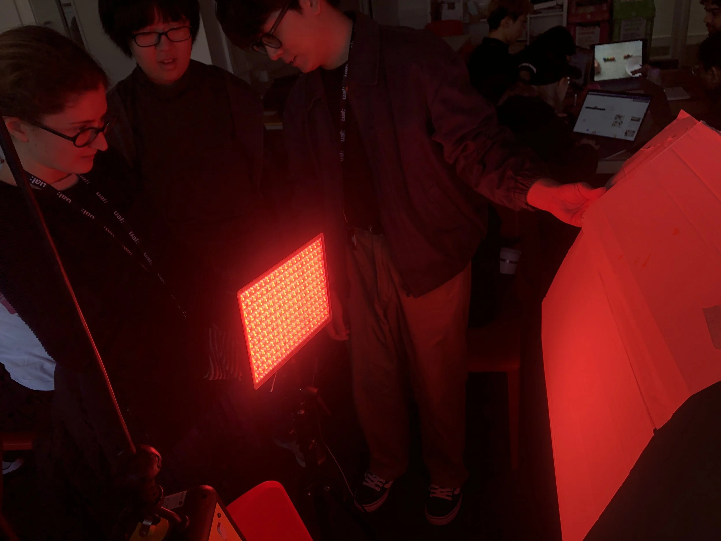
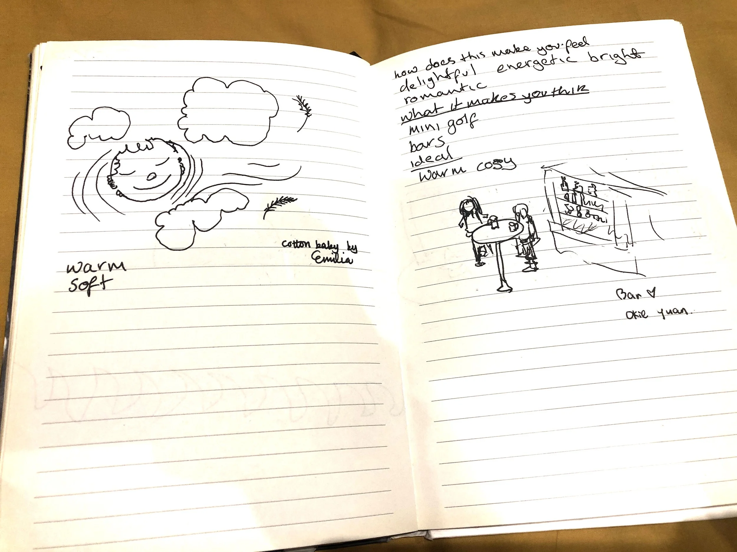
We then developed a creative toolkit using an LED light that Dahoon had rented. We asked participants to tune the light to their favourite shade, answer questions about it, and draw something about the colour. We developed a set of questions asking them to describe their favourite shade, why, what ideas/memories they attached to this, and what feelings arose.
One limitation we experienced was convenient sampling, as the toolkit was done with class members, which may have skewed the sample.
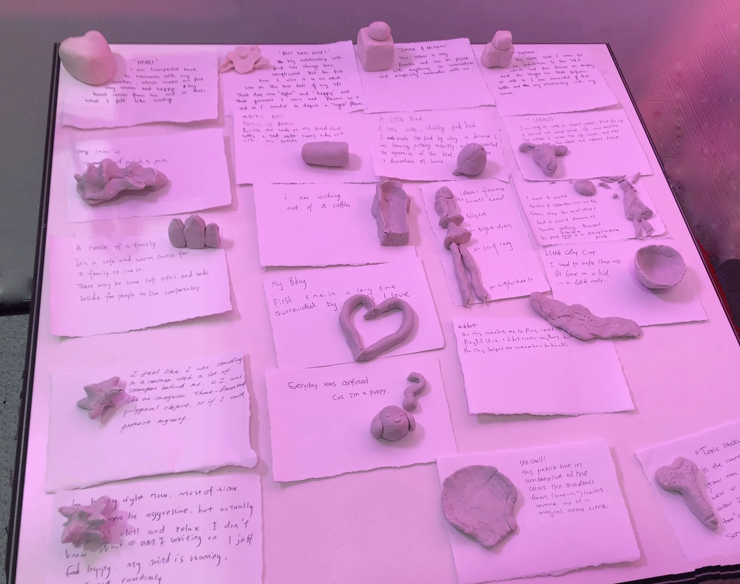
However, we did find a common theme of safety and acceptance, a quality severely lacking in today’s world. Unfortunately, I was ill for the presentation, but from what I understand, feedback was that: Do we need to find this generation’s pink? Or can we place this feeling of safety in the world more intentionally? With this feedback, we redesigned our toolkit, asking participants to make a 3D model out of clay about pink, surrounded by the shade of pink people most liked from our first toolkit. We also asked for a description of what the model symbolised to them. We placed our toolkit in the LCC atrium, which resulted in slightly less biased sampling. We then grouped the results into categories and found no clear majority of what pink meant to people. Then, we came to a bit of a creative halt as we could no longer decide on a way forward or where to place it.
We had a strong association with memory, so I researched psychological studies looking at this connection, showing the colour’s ability to help improve memory, its nostalgic qualities and its calming effect. My idea was to develop a creative workshop using the colour pink with dementia patients, utilising its feeling of safety to decrease negative feelings and promote mental health for the participants. I was preparing an interview to send to the doctors I know who had worked in these settings, but the idea was vetoed. We then returned to the idea of a breakout room using the imagery gained through the toolkit to illicit a feeling of safety in a stressful environment like work. However, I thought the idea seemed rather awkward as these were personal childhood memories for the most part, so it would not apply to all and may feel insipid to those with whom it didn’t connect. However, if you made it broader in appeal, it would potentially lose its ability to connect with anyone.
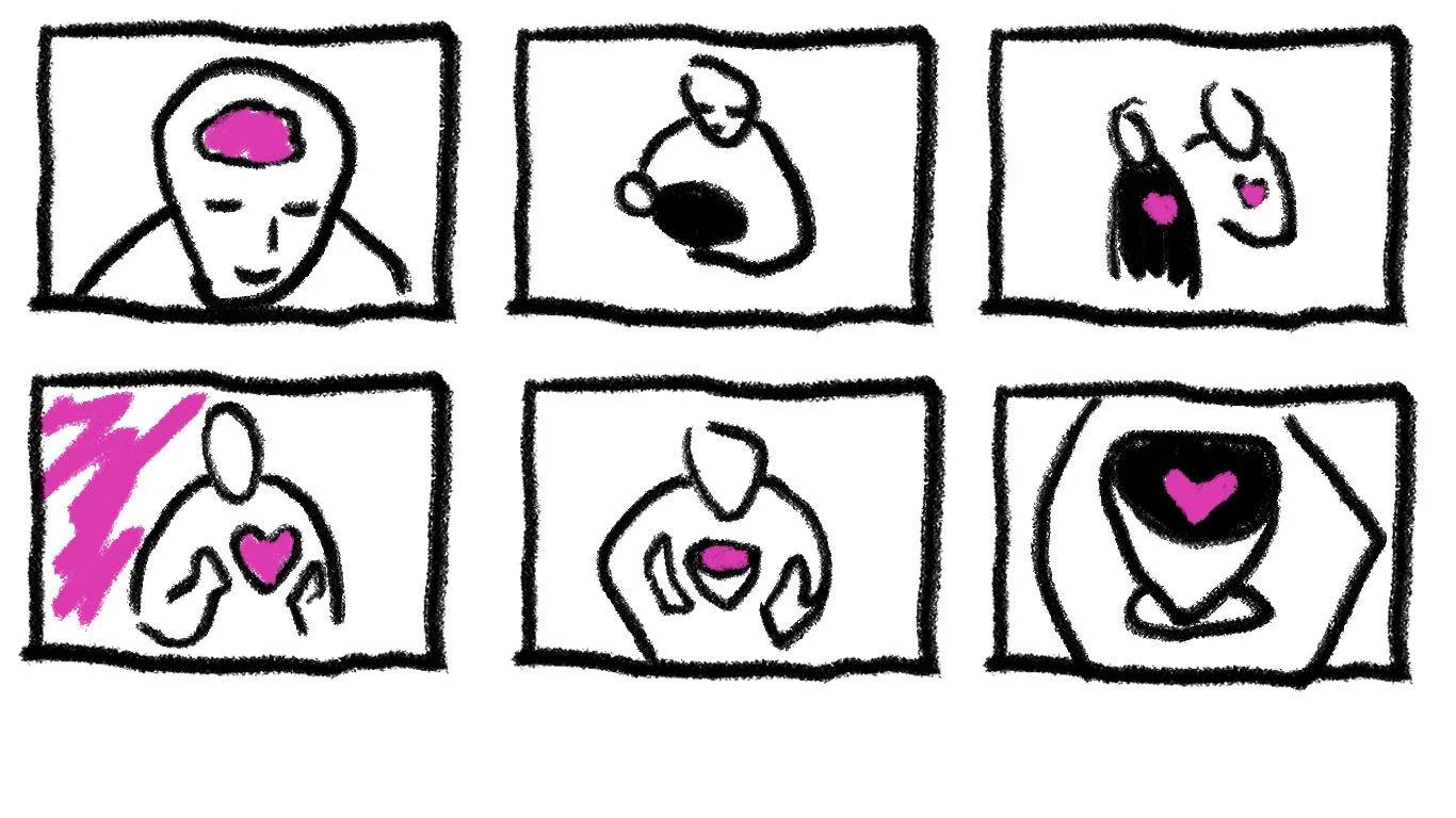
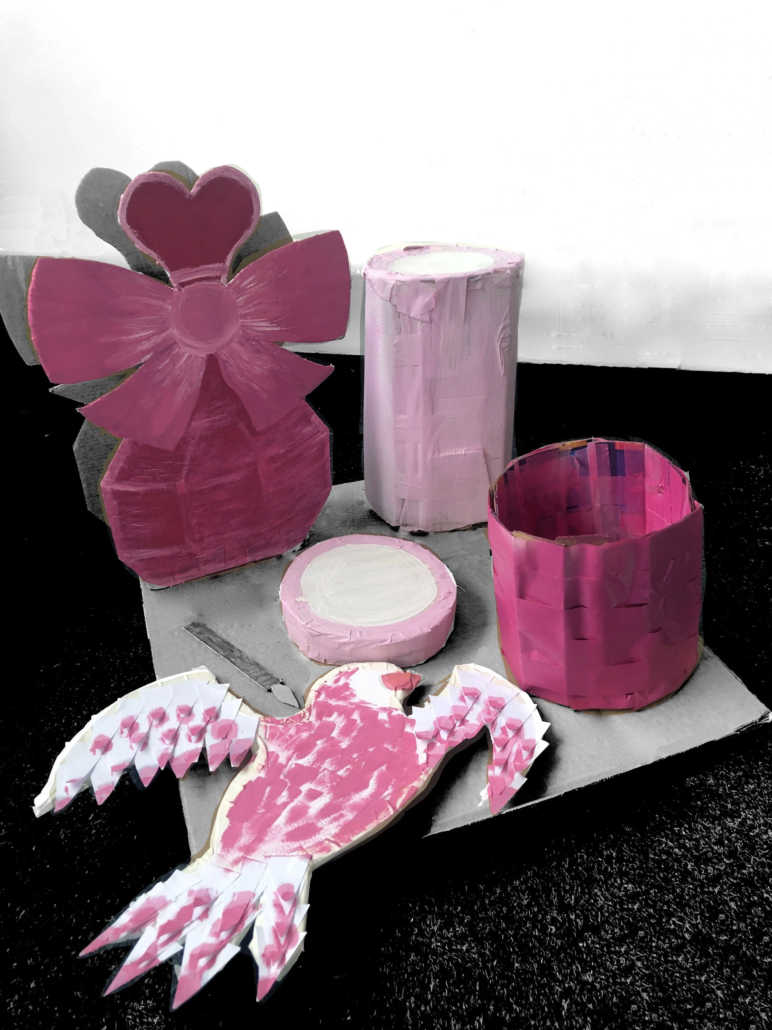
we created storyboard
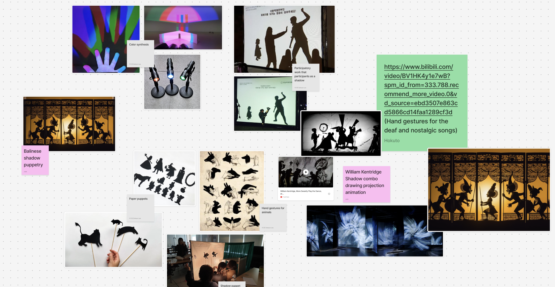
Tonisha suggested we return to the presentation of the toolkit findings as a memory museum while also looking at other ways of making it more interactive. We recorded a voice-over of all the stories rolled into one, thinking it could be slightly surreal and, therefore, easier to connect with the viewer’s personal experiences. We divided it into 5 main parts; Diya, Wanrui, and Chen made 5 artefacts that illustrated these sections. We then wanted to make these artefacts, aside from the voiceover, come to life somehow. Diya wanted to do this with shadow puppetry, which I didn’t think we had quite enough time to make and choreograph, so we compromised with a foe shadow puppet -frame-by-frame animation to play projected over the artefacts. I drew the frames while Dahoon animated them and created a way of making them playable in any order. We tried it out on some people and got some feedback, which we then incorporated into the design. Presenting it went well, but we needed to lead up the experience a bit more fully and make it a bit more of a journey around the space utilising the toolkit findings better.